Looking out for what looks good
July 27, 2009
In my last post, my website looked like a combination of gray squares (post-it notes), but now I have the dubious task of trying to pin down how exactly I imagine the site will look… will it have a dark background or a white one? Will it have a minimalist feel or be packed to the roof with information? How will the navigation function? Will objects have square corners or rounded ones?
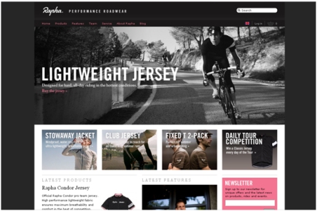
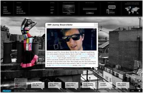
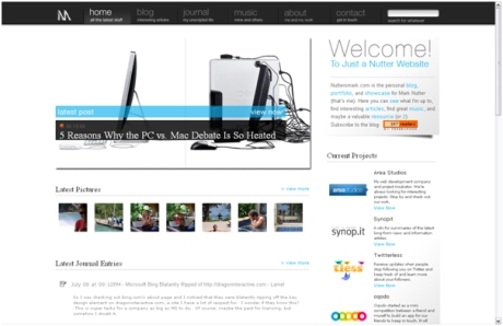
In order to find some inspiration I was recommended some galleries to look at such as Vandelay Design. Through looking at these sites I’ve started to pick out some elements that I like;
Great use of imagery.. because we’re dealing with an intentional market this is an important tool
“Sexy” navigation, especially the world beacon element
Still looking,
_c
